




Beyond Performance: The Language of Colour in Architecture
In our experience of thousands of façade projects, colour is often only brought into architectural design once the bigger decisions of form, function and material have already been made. Yet the impact of colour goes well beyond decorative. It can influence how a façade is perceived, help identify entrances and make different parts of a building easier to understand.
American architect, Galen Minah challenged the idea that colour should come after the “serious” decisions of architecture. Instead, they positioned it as integral to the design logic, to help architects organise space, sharpen form and make structural relationships more legible (1).
To understand why colour is sometimes overlooked, it helps to look at the history of architecture. From the Middle Ages, buildings for the most part, had been designed with elaborate, often colourful facades. The Modernist movement of the early-to-mid 20th century moved away from decoration and embraced simplicity, rational thinking and industrial production. Influential architects such as Le Corbusier, Walter Gropius and Mies van der Rohe favoured white surfaces and clean, restrained forms.
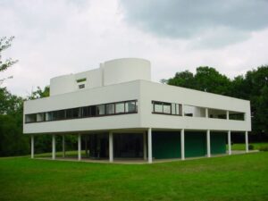
Le Corbusier, Villa Savoye (1928), Poissy, France(2)
Even the Bauhaus movement of the 1920s and 1930s, despite its exploration of colour, still celebrated the purity of white. The 1940s through the 1960s saw the emergence of glass, steel and concrete as the dominant themes, with colour generally considered a surface treatment rather than an architectural tool. In British Architect, John Pawson’s iconic work(3), monochrome functions as a vehicle for minimum expression: a reduction of colour that allows form, material, light, and proportion to become the primary subjects. Modernism gave architecture valuable lessons in form, materials, light and shadow, but it also contributed to a period in which colour played a smaller role. While that restraint can be beautiful – as demonstrated by Pawson’s designs – it is not the only route to successful design.
It wasn’t until the 1970s that colour began to regain importance, and by the 1980s, was once again recognised as a legitimate design tool.
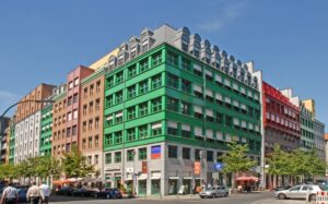
Aldo Rossi’s 1996 Quartier Schutzenstrasse in Berlin(4)
However, even today, colour all too often is not addressed until the function, form and texture of a building envelope have already been defined.
This matters because colour is one of the first things people notice about a building. Research into colour in architecture and urban environments shows that it influences how people interpret and respond to places. Long before a façade is understood through shape or detail, its colour has already made an impression.
There is an important difference between colour theory and colour psychology. Colour theory helps designers understand how colours work together through contrast, balance, tone and proportion. Colour psychology looks at how those choices affect mood, behaviour and perception. Used together, they help architects create spaces that not only look attractive, but also feel intuitive and appropriate for their purpose.
In schools, where Benx has been involved in many new build and refurbishment projects in recent years, colour has been used to help signal purpose, guide movement and create subtle shifts in energy between spaces.
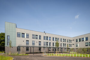
Belvidere School, Shrewsbury – Photography Credit, Bowmer + Kirkland
In healthcare settings, we often see softer, lighter facade palettes used to promote a sense of reassurance. In contrast, hospitality and entertainment buildings frequently feature reds and oranges to signal activity and energy. In general, warmer colours prompt a sense of excitement and urgency, while cooler colours are more commonly linked with calm and restraint, although there are no fixed rules.
Colour is never experienced in isolation, as light, texture, scale and surrounding materials can all alter its effect. For example, a muted green on a shaded façade may feel entirely different from the same tone under direct sun or beside warmer masonry.
The meaning of colour is also shaped by history, traditions and culture. For example, red can represent celebration, warning, warmth or authority, depending on the context. The most successful architectural palettes respond to their surroundings and the people who use the space.
People react to colour instinctively, so it should never be treated as an afterthought. Used thoughtfully, colour can give a building identity, character and immediate recognition. Even a single colour can have a significant impact when used with care and precision.
On a façade, colour can help define volume, create rhythm, highlight entrances and strengthen a building’s presence within a streetscape. It can also help a building sit more comfortably within its surroundings.
Historically, architectural colour was often limited by available pigments, local materials and building techniques. Today’s designers have much more freedom. Benx’s CladColour façade panels make it possible to achieve colour strategies that would once have been difficult, expensive or technically challenging.
As a result, colour can take its place as a central part of the design process, helping buildings respond not only to performance requirements and climate, but also to identity, atmosphere and the human experience.
– Ian Wilson’s Perspective, Benx Group Chairman
Sources
- ‘Colour as Idea: The Conceptual Basis for Using Colour in Architecture and Urban Design’ – Galen Minah, College of Architecture and Urban Planning, University of Washington.
- Source: Valueyou (Wikipedia) https://en.wikipedia.org/wiki/File:VillaSavoye.jpg#file
- ‘Minimum’ – John Pawson, Phaidon Press (London).
- Source: Creative Commons https://www.berlinlayers.com/blog/quartier-schutzenstrasse
